While working on the redesign of most of the site for Giant Bomb, there was a need to be able to display and organize like content for users to find more easily and naturally.
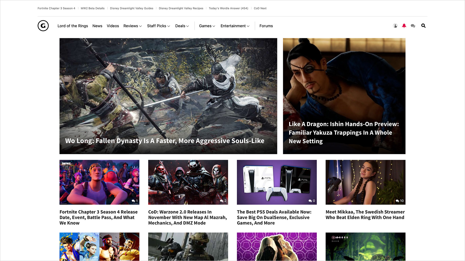
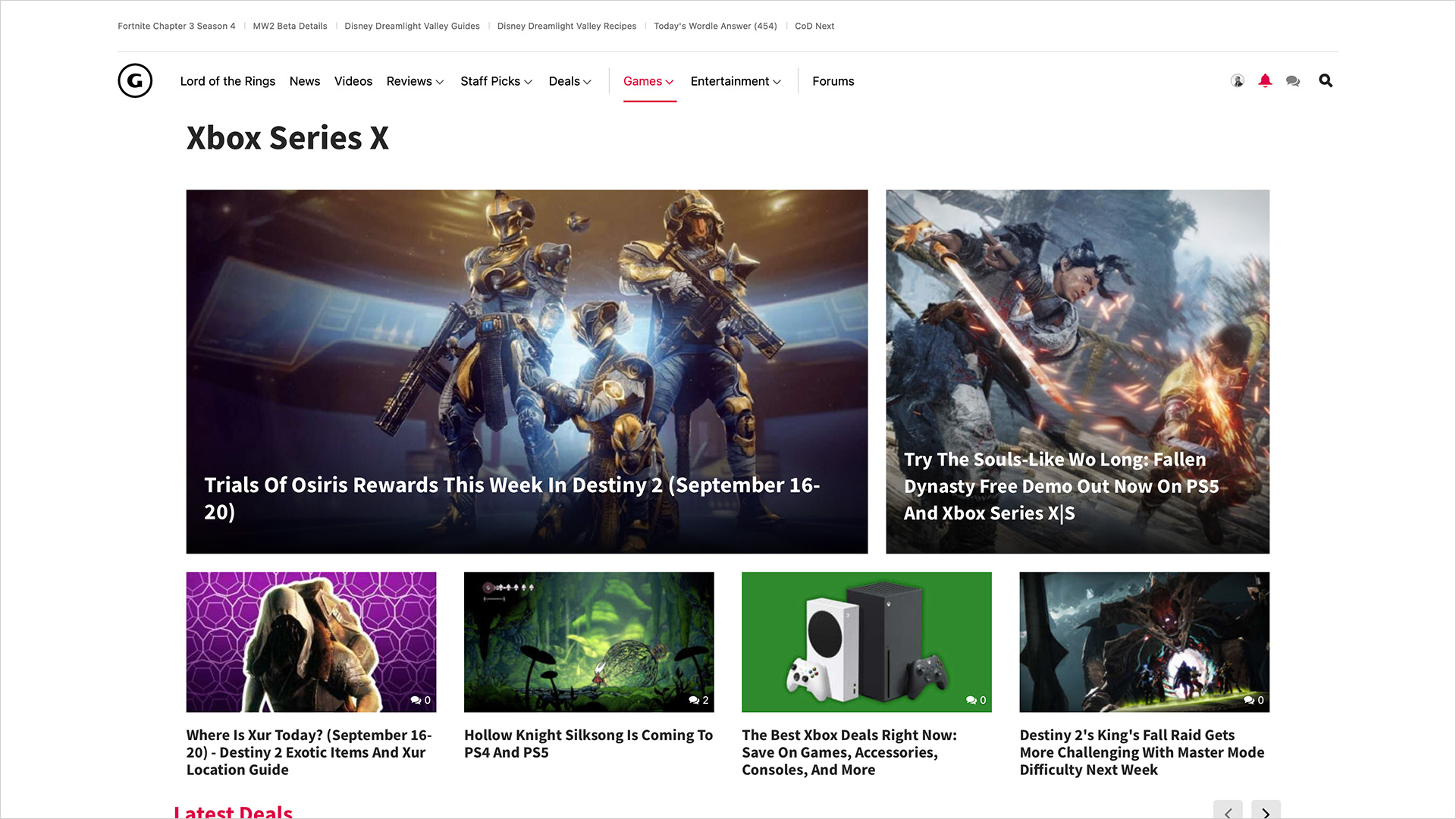
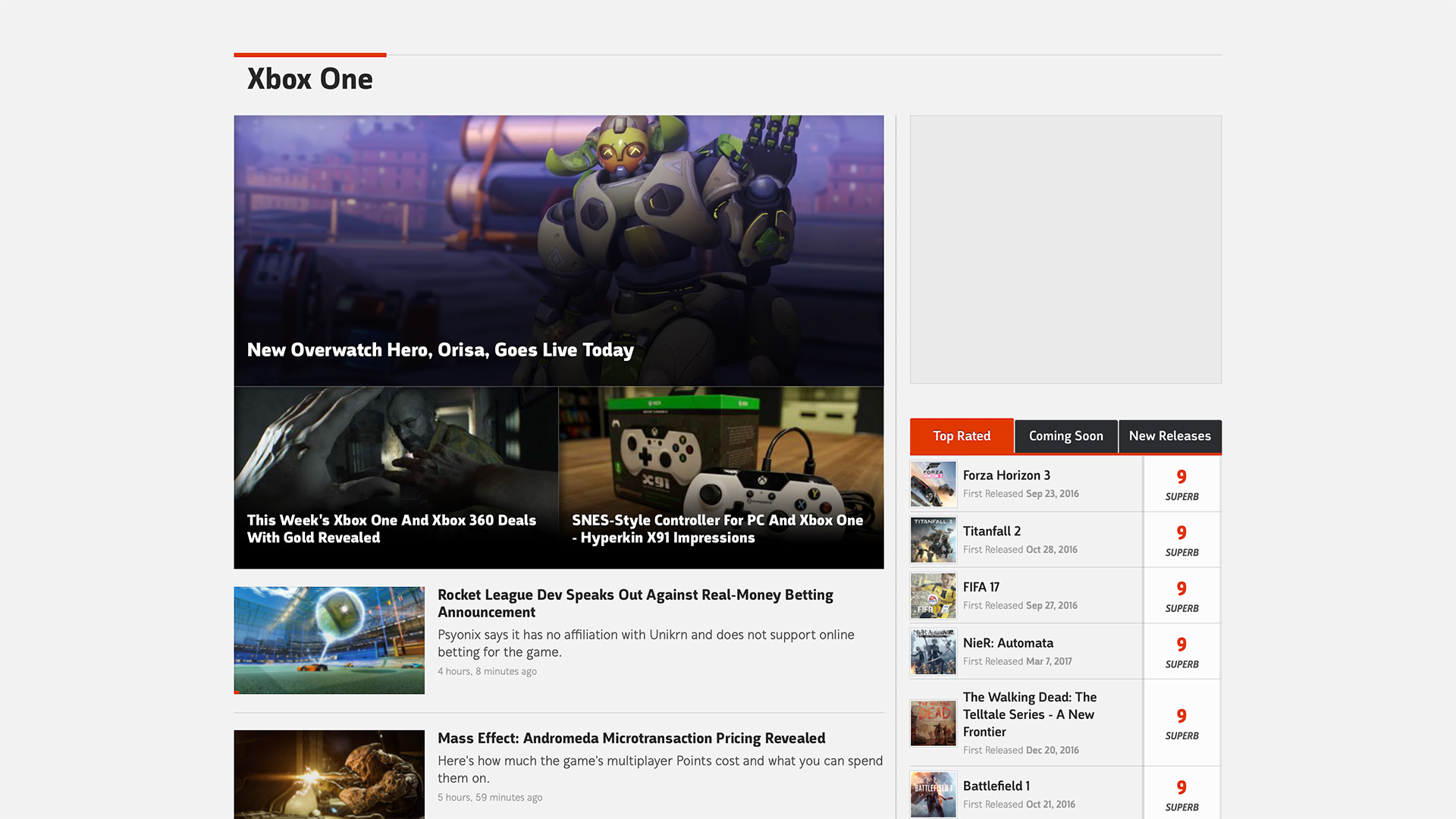
Events are a major aspect of GameSpot's coverage, from E3, Summer Games Fest, the Game of the Year awards, and more. Having a scalable pattern that could grow with content but still remain organized was critical.
In order to create images for each of the promoted pieces of content, the graphic designers on the team internally had unreasonable restrictions on what they could work with from one layout and hub to another, often creating a significant amount of extra work and rework to ensure an image could work across the board.
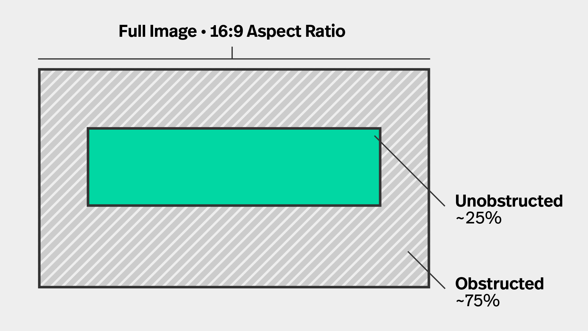
Each of the main hubs throughout GameSpot and Comic Vine had very different layouts for promoted content at the top of the pages across all device types. Aspect ratios seemed arbitrary with imagery and text often looking obstructed and inaccessible.
Another big concern was how bloated and inconsistent the implementation was from an engineering perspective. Bug fixes and iterative updates to any of the promo layouts took significantly more time and effort than what could have been if all of the layouts were consistent and standardized.
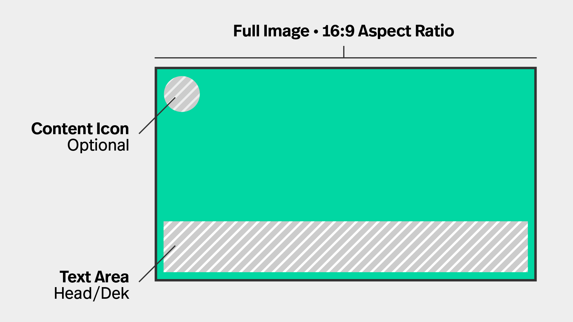
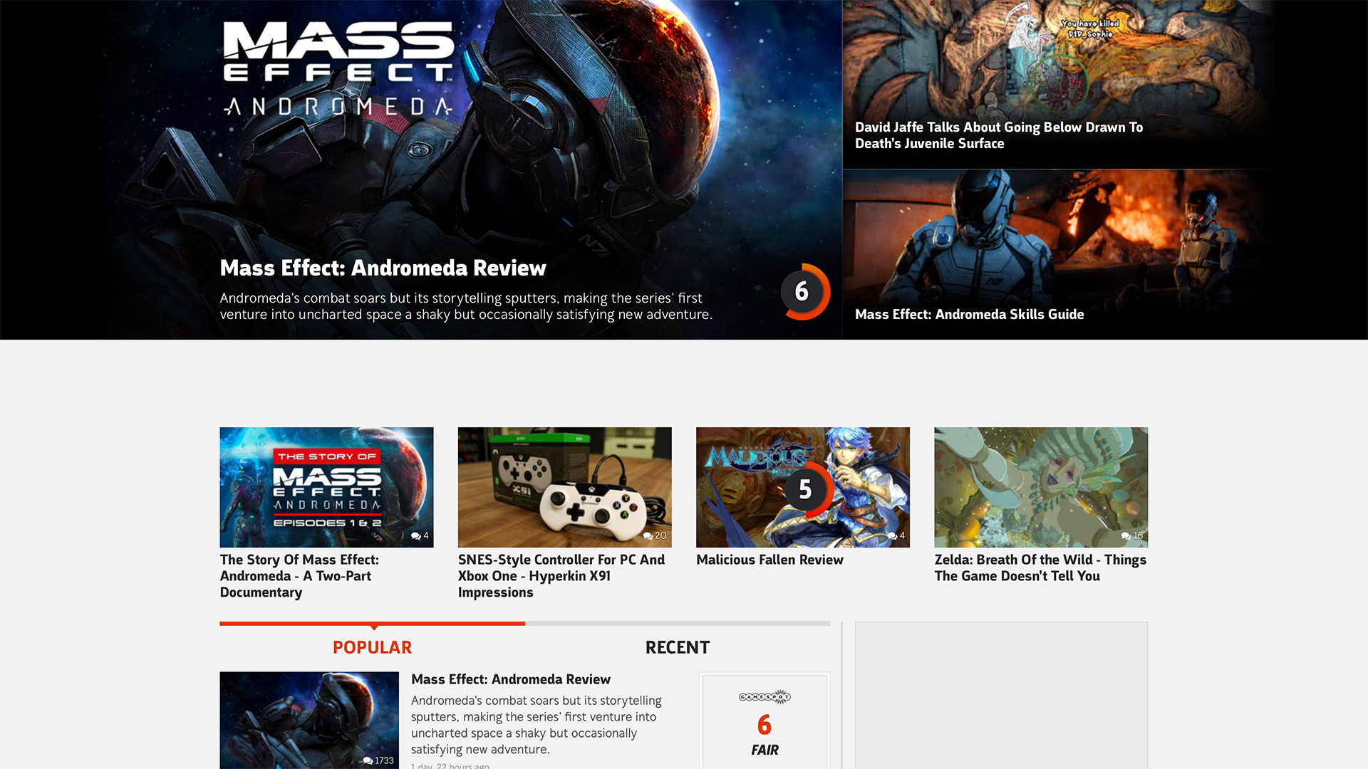
Text treatment was relocated uniformly to the bottom of each promo and left justified so there was no ambiguity on where it could end up.
In some optional cases, icons were added in standard sizes to the top left of promos to delineate the difference between content types like image galleries, reviews, etc.
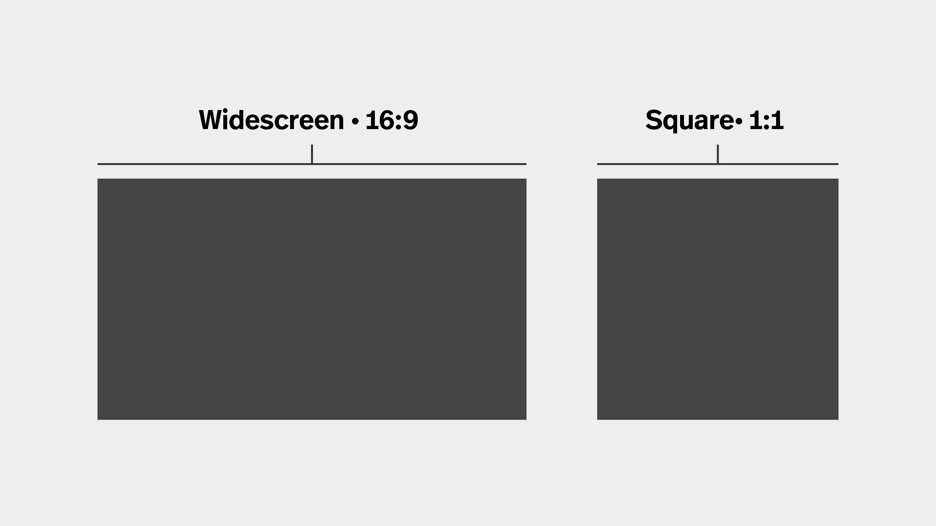
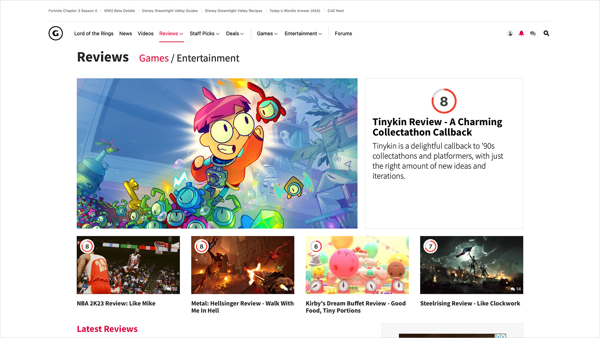
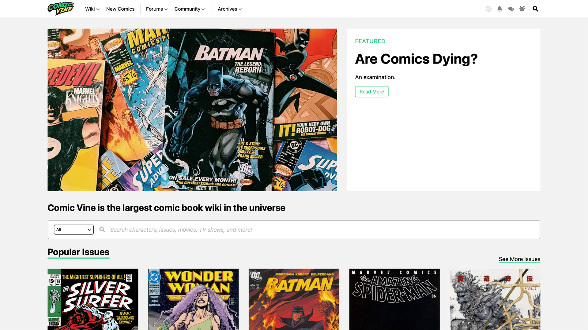
Having a large collection of aspect ratios based on stylistic choices, the variations were reduced to two options: widescreen (16:9) or square (1:1).
The square aspect ratio is programmatically cropped from the center of the widescreen images allowing predictability and consistency.
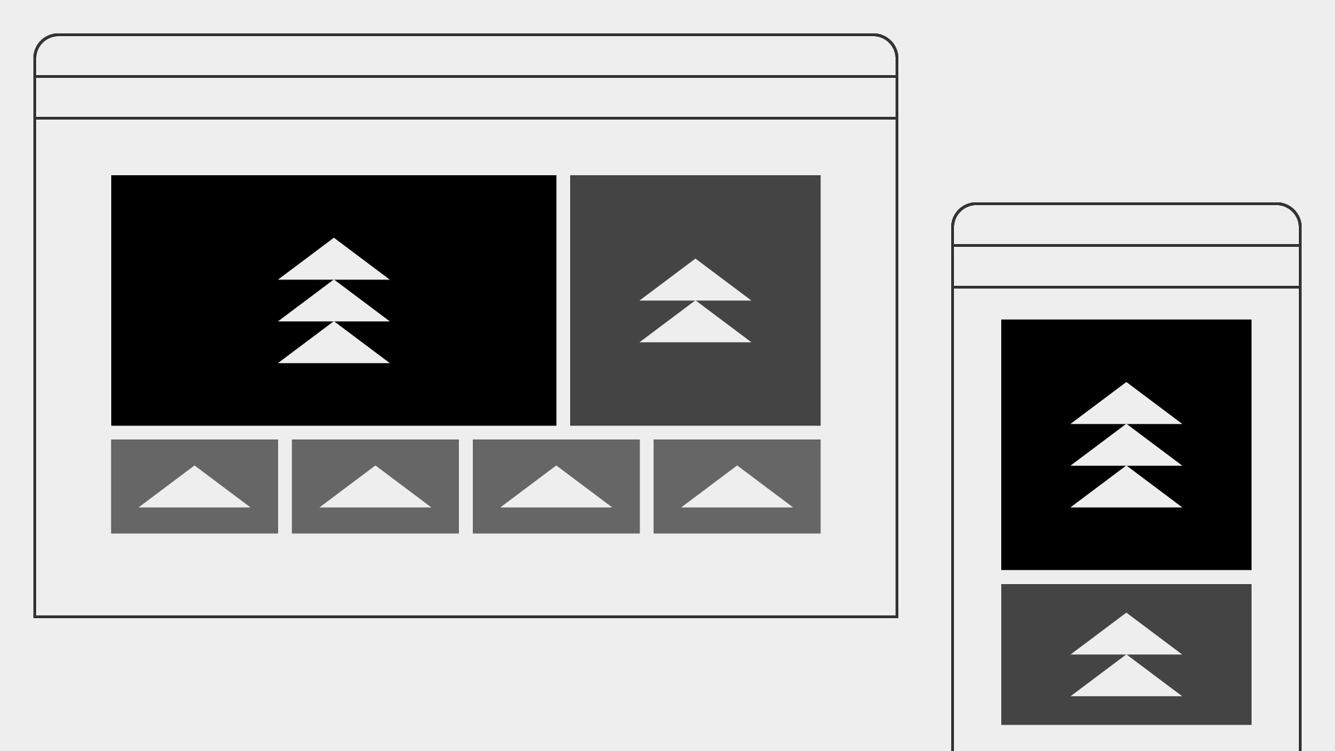
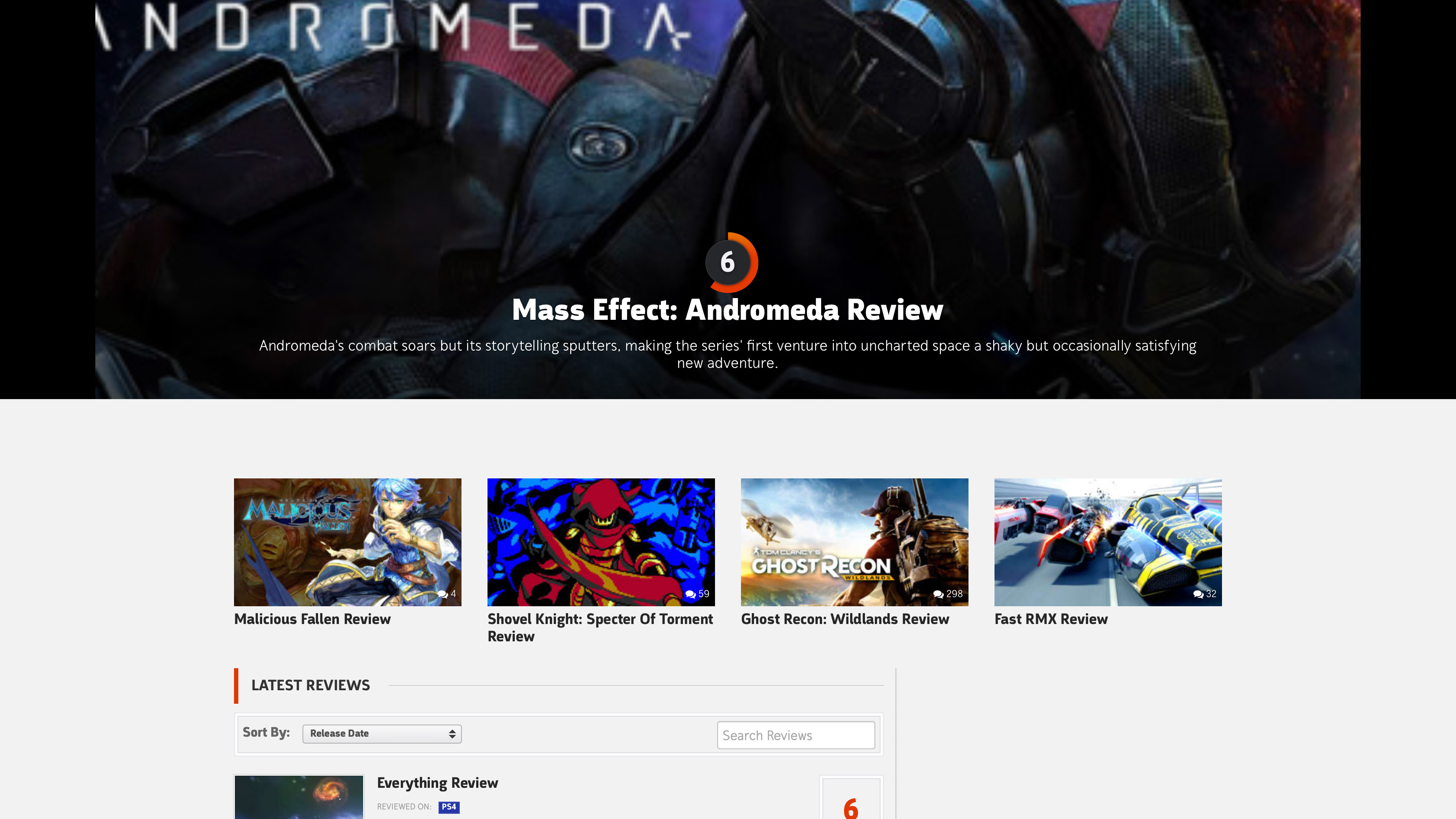
The layouts were reworked taking the image standardization constraints into consideration. The result uses both the widescreen and square aspect ratios where necessary across each responsive layout.
The result provided a couple of simplified modules – a generic, multi-promo layout as what is used on the GameSpot homepage and a single-promo layout like what it seen for the GameSpot Reviews hub and Comic Vine homepage.